How to change the number of breaks on a datetime axis with R and ggplot2
May 6, 2017 · 3 minute read · CommentsIt took me a surprising amount of time to find how to change the tick interval on ggplot2 datetime axes, without manually specifying the date of each position. The solution is surprisingly simple and clear once you know the syntax:
scale_x_datetime(date_breaks = "12 hours")
This places a break every 12 hours. The interval can be any value accepted by the scales package: “sec”, “min”, “hour”, “day”, “week”, “month”, or “year”. The trailing s is ignored. Read along for examples and instructions on how to rotate the label text.
Updated 2 Feb 2018: changed from using breaks argument to using date_breaks argument.
Examples
Let’s illustrate with some fake data. I’ve re-used the CSV data from my Shiny tutorial. You can download the file here. The format looks like this:
"timestamp","date","origin","variable","value"
1448315085.07,2015-11-23 21:44:45,"kitchen","temperature",24.4
1448315085.07,2015-11-23 21:44:45,"kitchen","humidity",44.9
1448315085.07,2015-11-23 21:44:45,"bedroom","temperature",24.8
1448315085.07,2015-11-23 21:44:45,"bedroom","humidity",46.1
1448318685.07,2015-11-23 22:44:45,"kitchen","temperature",23
1448318685.07,2015-11-23 22:44:45,"kitchen","humidity",41.1
1448318685.07,2015-11-23 22:44:45,"bedroom","temperature",23.6
1448318685.07,2015-11-23 22:44:45,"bedroom","humidity",45.7
1448322285.07,2015-11-23 23:44:45,"kitchen","temperature",23.4
...
Let’s load it into an R dataframe, making sure to convert the date column to an R datetime object (see my previous post on the subject), then create a simple plot of temperature versus time:
library(ggplot2)
library(scales)
library(dplyr)

data <- read.csv("data.csv")
data$date <- as.POSIXct(data$date)
temperatures <- filter(data, variable == "temperature", origin == "kitchen")


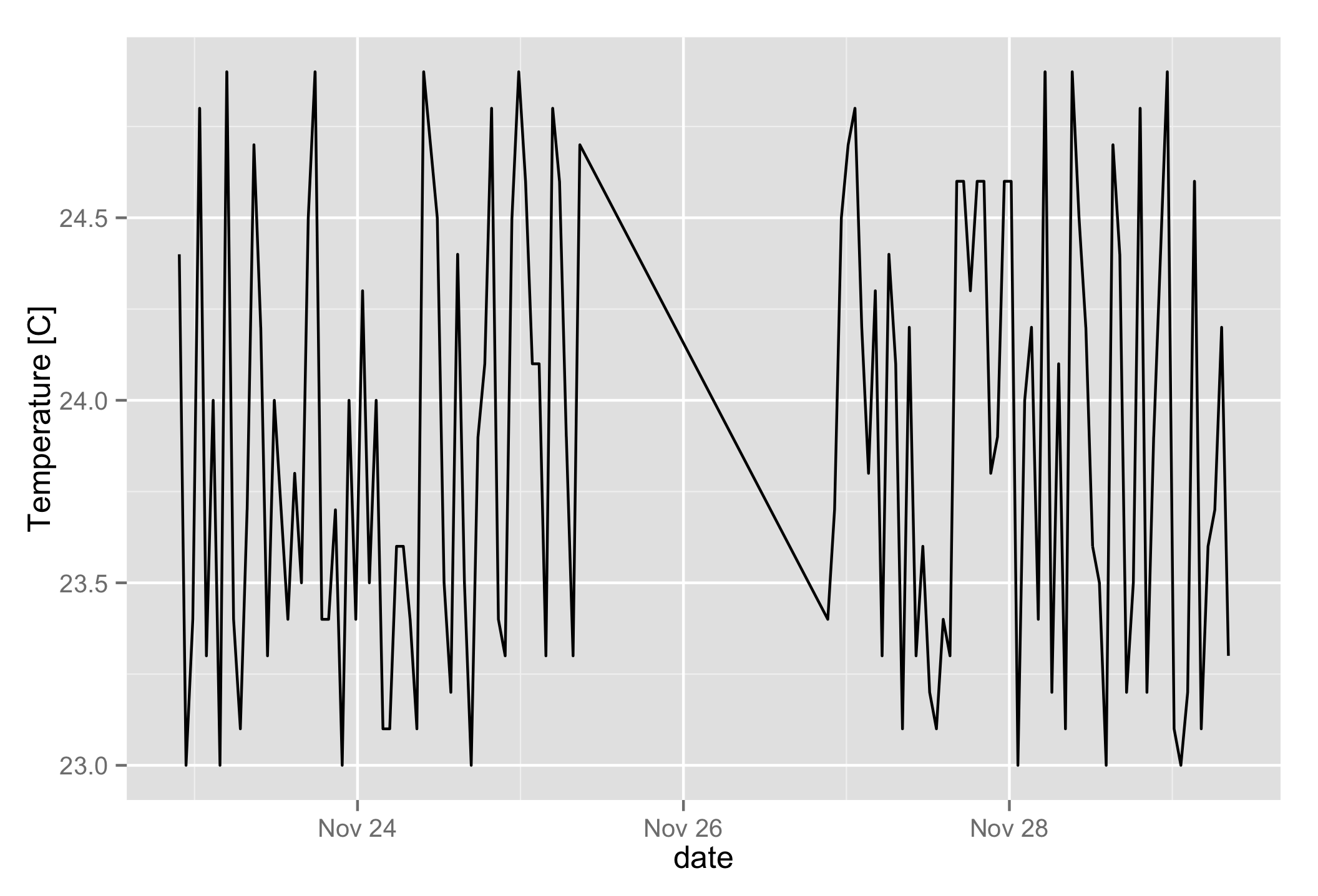
qplot(date, value, data = temperatures, geom="line", ylab = "Temperature [C]")

The default breaks are quite sensible, but for the sake of illustration let’s change them to a break every two days. The label format follows strftime syntax (see http://www.foragoodstrftime.com/ for help building them):
qplot(date, value, data = temperatures, geom="line", ylab = "Temperature [C]") +
  scale_x_datetime(date_breaks = "2 day", labels = date_format("%b %d"))

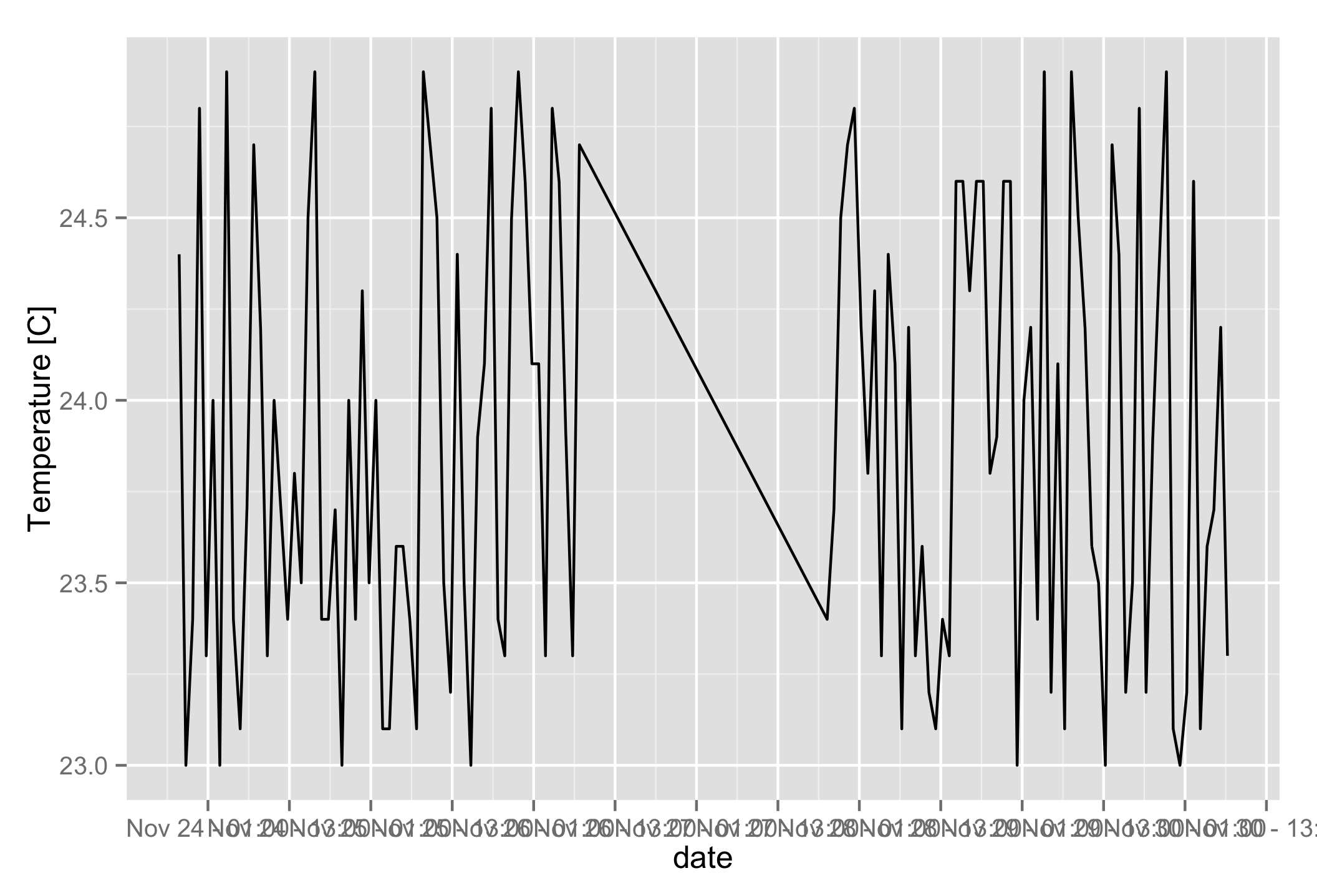
You can see the number of breaks has changed. Most of the time, I’m more interested in increasing their density. Let’s switch to an interval in hours, and also include the time in the labels:
qplot(date, value, data = temperatures, geom="line", ylab = "Temperature [C]") +
  scale_x_datetime(date_breaks = "12 hour", labels = date_format("%b %d - %H:%M"))

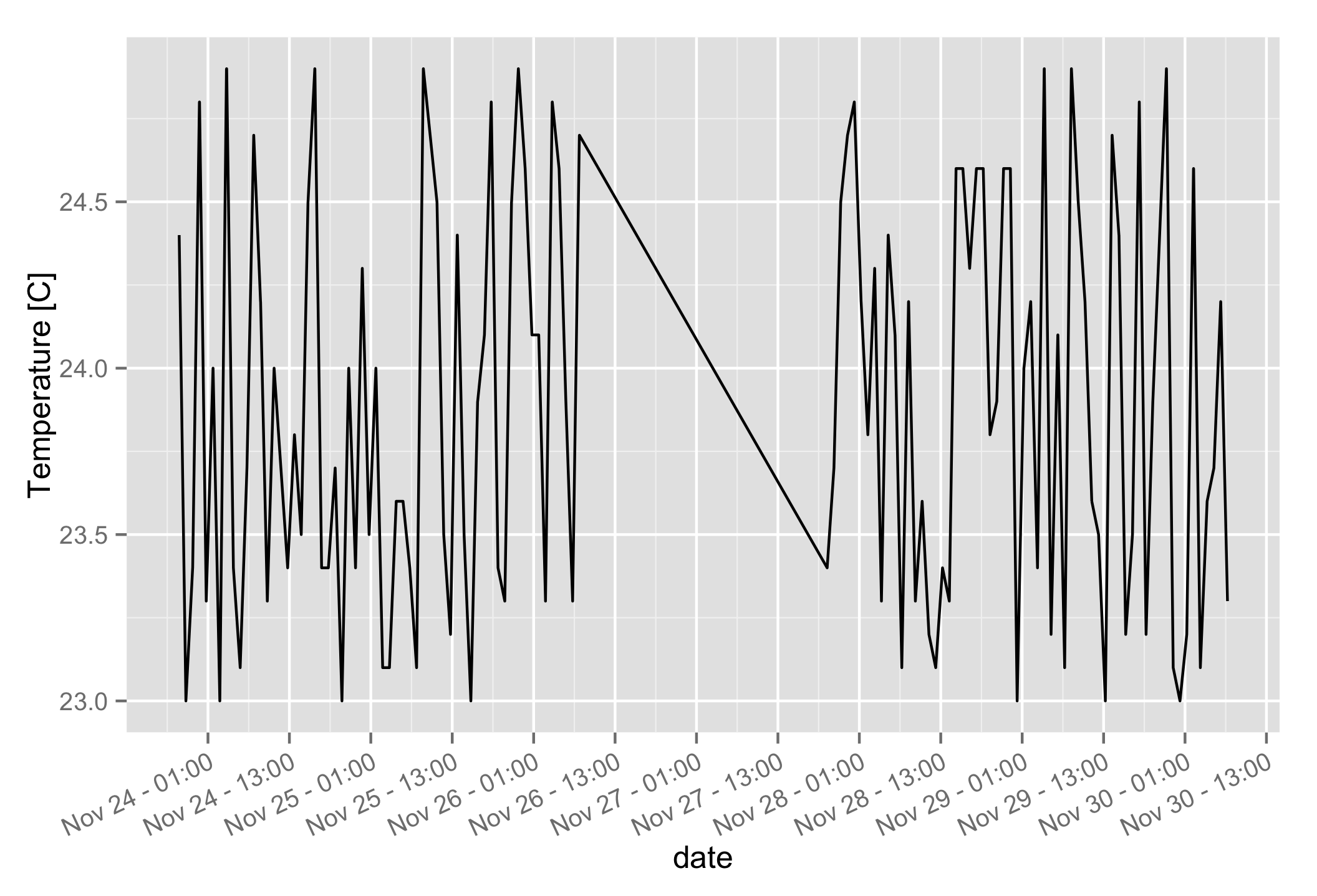
Ouch! The labels are unreadable. Thankfully we can rotate the text to prevent them from overlapping:
qplot(date, value, data = temperatures, geom="line", ylab = "Temperature [C]") +
  scale_x_datetime(date_breaks = "12 hour", labels = date_format("%b %d - %H:%M")) +
  theme(axis.text.x = element_text(angle = 25, vjust = 1.0, hjust = 1.0))

That’s a lot better! If you set the angle to 90 degrees, or if you have an older version of R, you will need to play with the vjust and hjust values until the labels line up correctly. Try adding debug = TRUE to element_text to display the text anchor point.
Including these in a library
I found myself loading the same data format and making similar graphs across many R notebooks, so I wrote a small library of functions that I could re-use in all of my analyses. Hillary Parker’s guide explains everything you need to write your own. My functions resemble the code below, where I can optionally specify a tick interval. The labels include the time automatically if I specify an interval in hours. If I leave the argument blank, ggplot keeps its defaults:
plot_temperature <- function(data, title = "", breaks = "", angle = 25) {
    p <- ggplot2::qplot(date, value, data = data, ylab="Temperature [C]")

    if (title != '') {
      p <- p + ggplot2::ggtitle(title)
    }

    if ( breaks != '' ) {
      if ( grepl("hour", breaks) ) {
        fmt <- "%b %d - %H:%M"
      } else {
        fmt <- "%b %d"
      }
      p <- p + ggplot2::scale_x_datetime(date_breaks = breaks, date_labels = fmt) +
        ggplot2::theme(axis.text.x = ggplot2::element_text(
          angle = angle, vjust = 1.0, hjust = 1.0
        ))
    }
    return(p)
}
When you move your function to an external library, it’s important to specify the namespace of every function you call. Hence the ggplot2:: scattered all over.