An interactive map of mass shootings based on Shiny
Mar 15, 2018 · 8 minute read · Comments“Four? That’s barely your average family murder-suicide!” - Anonymous American
The United States saw 427 mass shootings in 2017, making a total of 2571 victims. That’s more than one shooting per day.
Why don’t you hear about them on the news every day? Or conversely, if they are so common, why did the recent shooting in Las Vegas or the night club shooting in Orlando get so much attention?
These numbers are gathered by MassShootingTracker.org, who define a mass shooting as an event with four or more victims, including dead and wounded. I heard several people react along the lines of the quote above, who said that four people is hardly a mass shooting by American standards. So, how would the numbers change if you changed the definition? This question inspired me to make an interactive visualisation of the data, with a slider that lets you pick your own definition of a mass shooting. I then got intrigued by where they were happening: in what states? Can we show them on a map? When are they happening, are there more and more every year? What about Europe, how do their numbers compare? Read on to learn more, or head over to the interactive app to answer those questions and play with the data yourself.
This being a technical blog, however, the goal is not to make a social or political analysis, but rather to explain how I built the app. Read along to learn more about the unexpected challenges I encountered to represent the data on a map and cache location data for online deployment; maybe you’ll learn from some of my mistakes.
Basics
If you are new to Shiny, you can skim through my first article on the subject here.
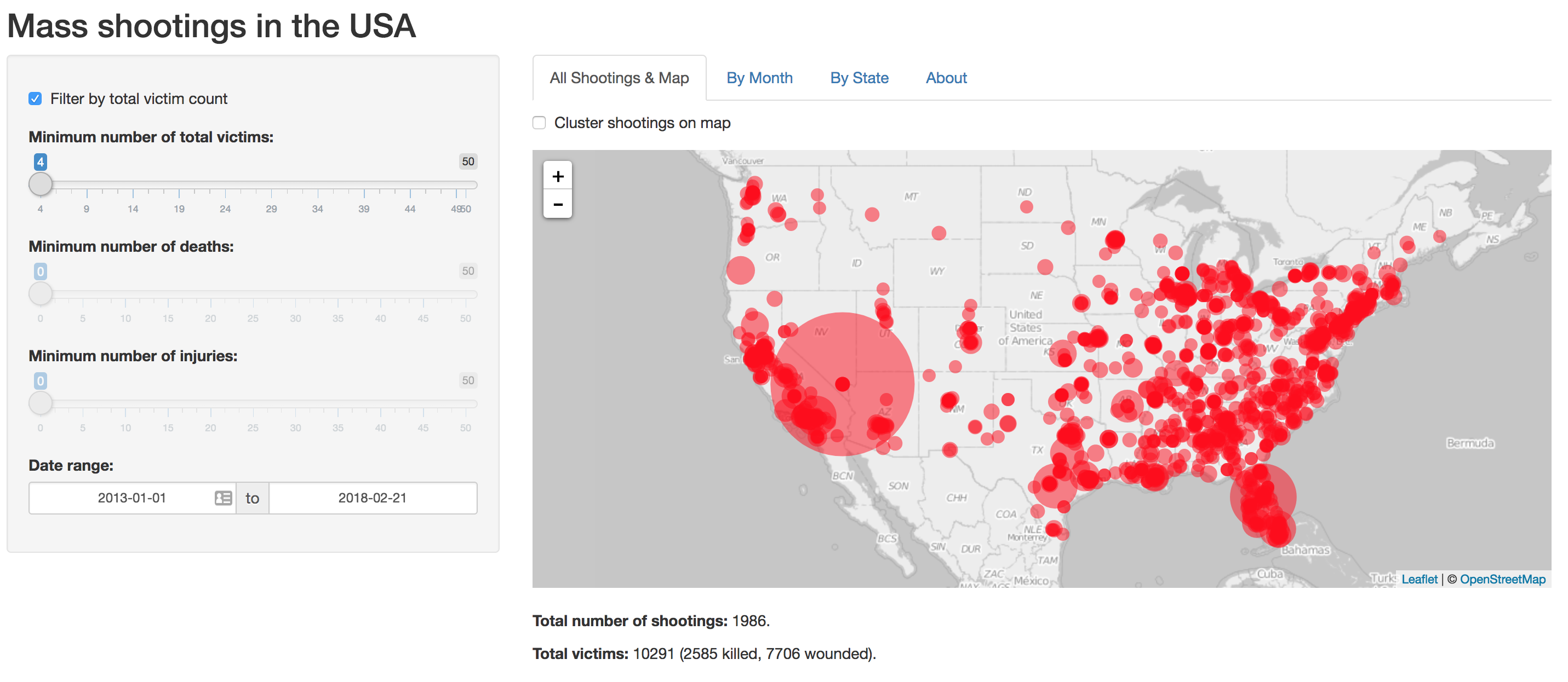
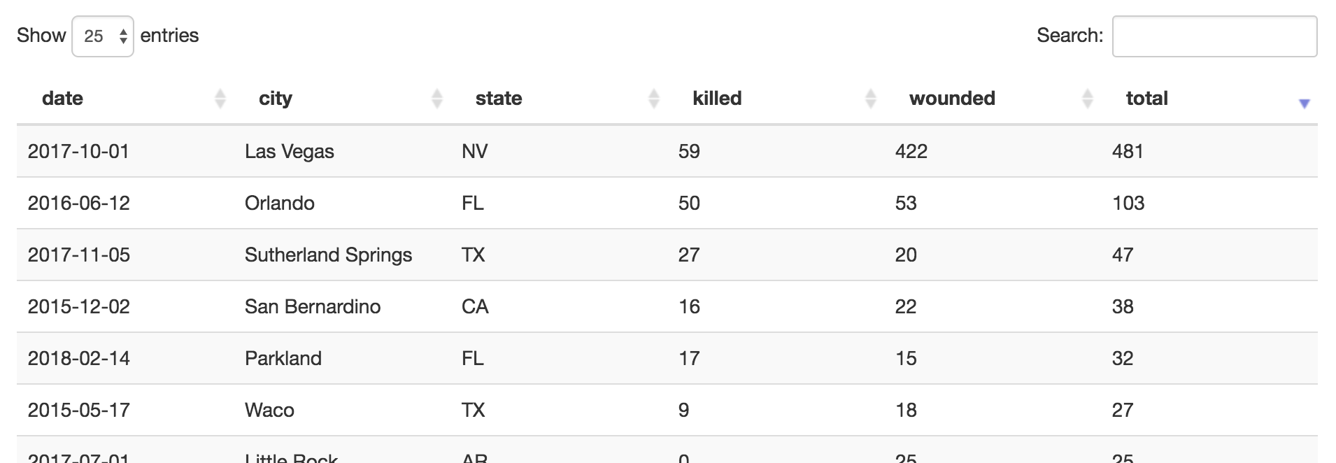
The visualisation is a Shiny application, hosted on the free tier of Shinyapps.io. A couple of filters can select events by date range, or limit the minimum number of victims. A map (shown above) shows the location of every event, marked by a circle whose area is proportional to the total number of victims — you’ll notice that the Florida and Nevada circles are much larger than any of the others; these shootings were exceptionally violent. Clicking a marker pops up links to related news articles. Optionally, events can be clustered on the map to reduce clutter. A searchable table shows a list of all events:
Two bar graphs show number of shootings and victims per month. Interestingly, they show a cyclic trend: shootings are more common in the summer.
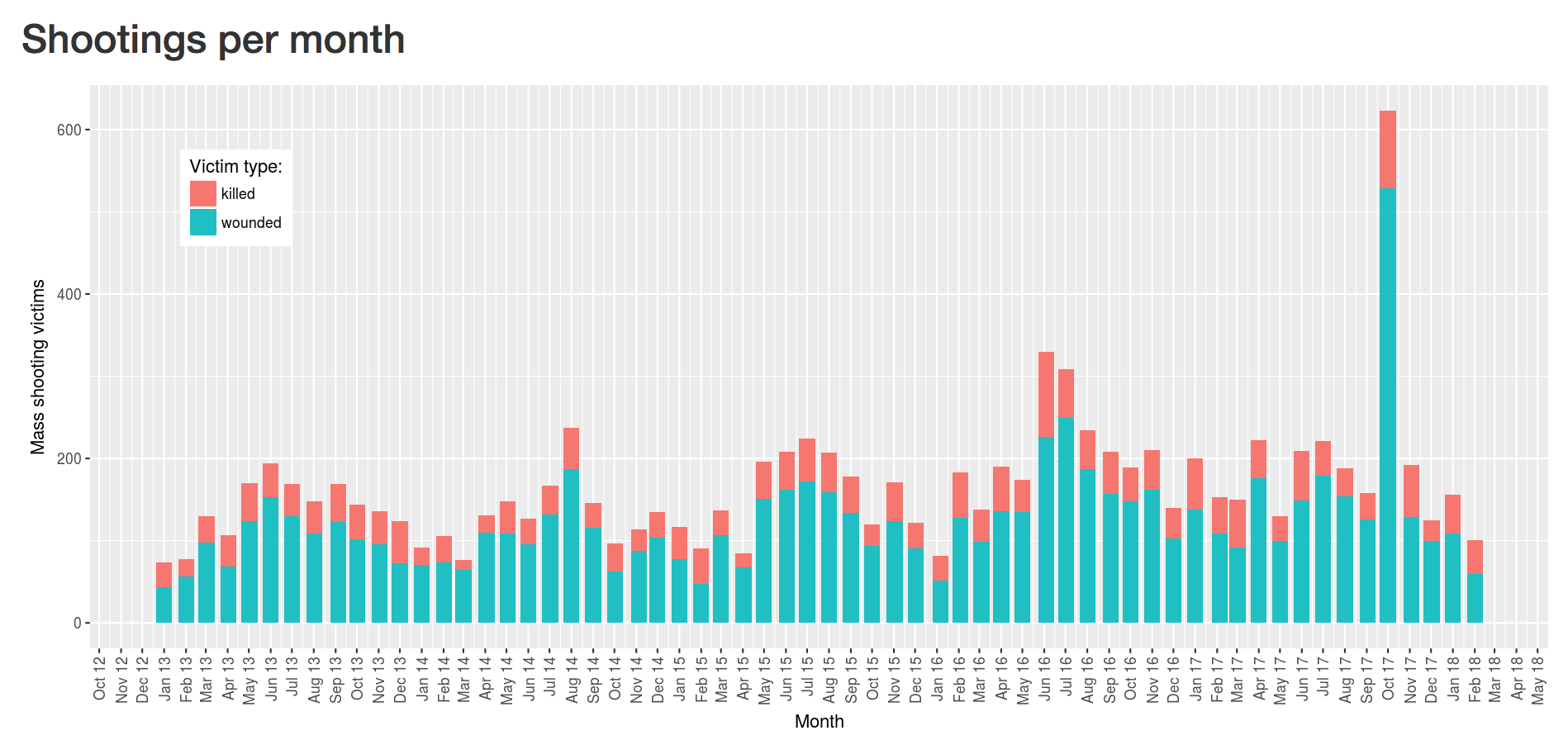
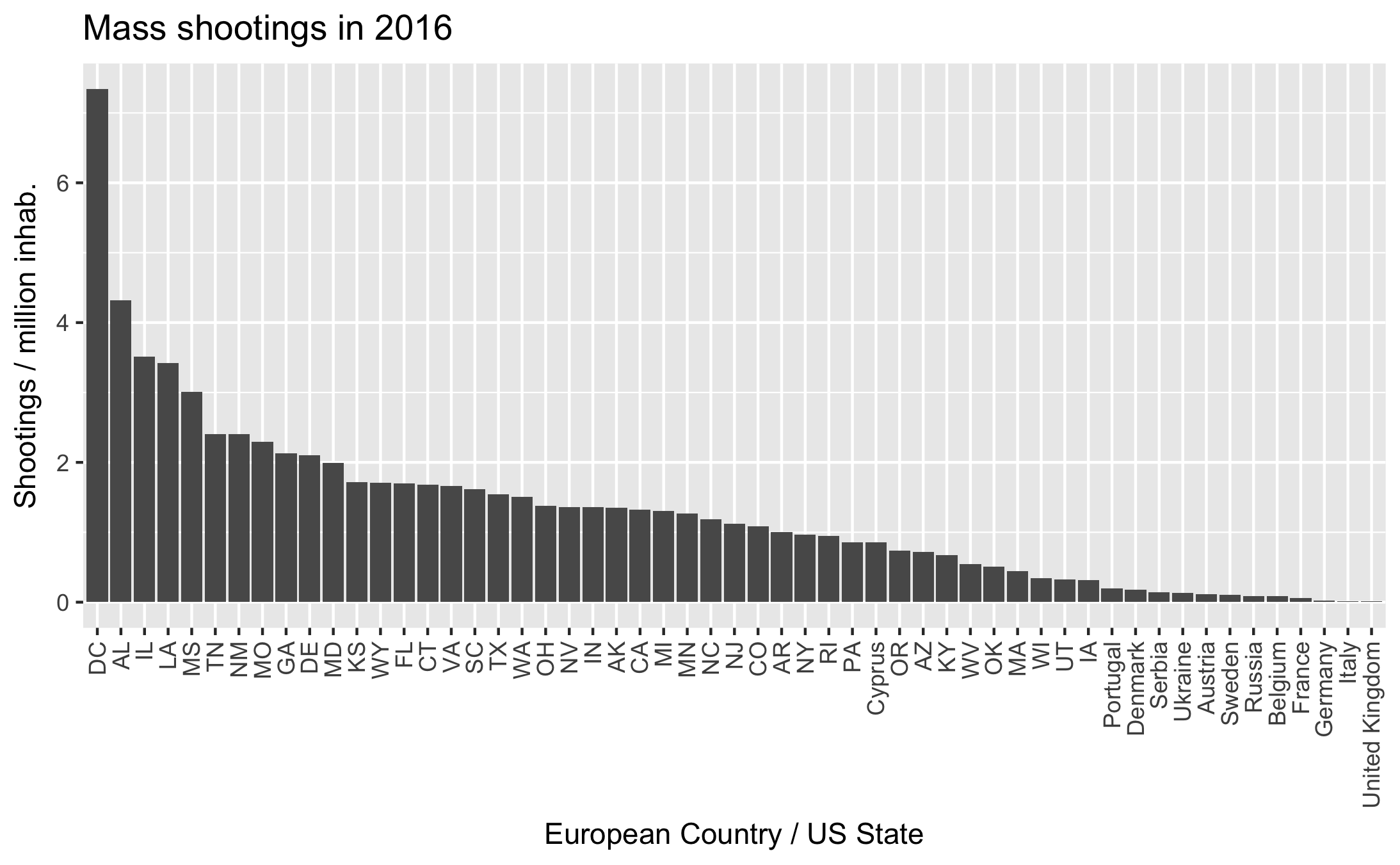
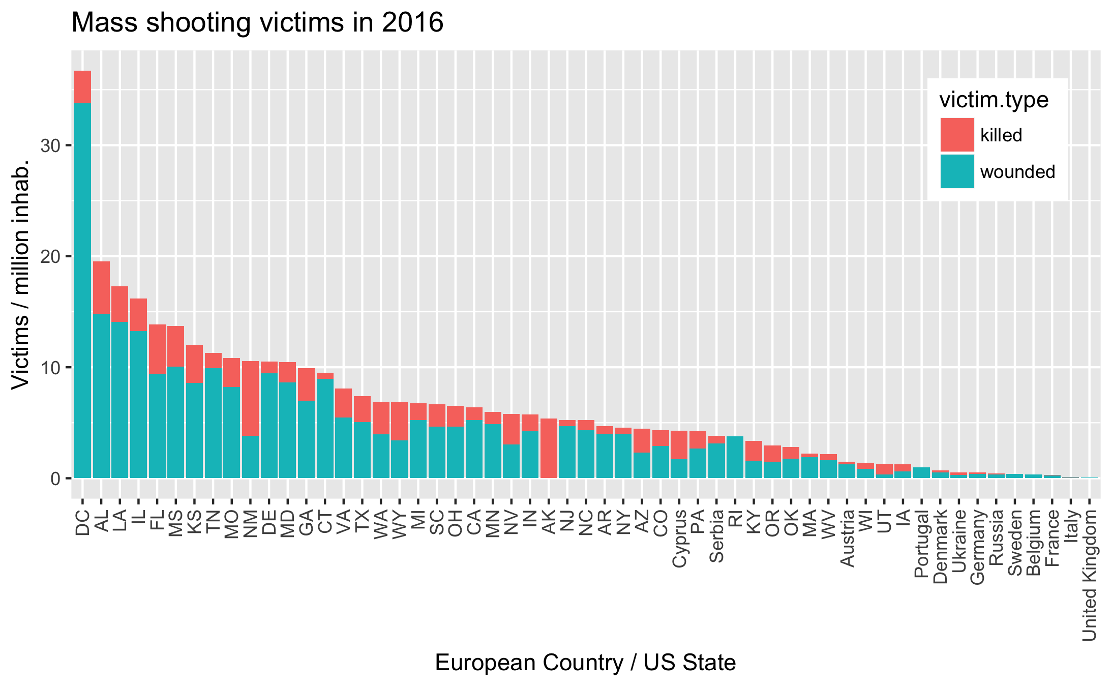
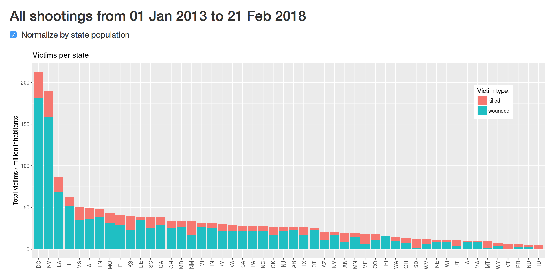
Another set of graphs shows the number of shootings and victims per state, optionally normalised by state population. The absolute totals just tend to show that larger states have more shootings. Per capita numbers show that D.C. is the most dangerous state!
The end result is slow, so either my approach or choice of platform probably weren’t the best. It would be interesting to deploy the app to a faster service, to see if the issue comes from an inherent slowness of Shiny, or from the limitations of shinyapps.io.
Data and tools
The data is provided by MassShootingTracker.org, in the form of one CSV file per year. The file for the current year is continuously updated on their website, thus my app downloads the latest version every time it is reloaded. Files from previous years are saved to disk.
The list of shootings contains one row per shooting, with a column for date, city name, state abbreviation, and number of killed and wounded, as well as links to related news articles. I mixed in population data from the US census bureau, and geographical coordinates of each city from OpenStreetMap. On the visual side, maps are handled by leaflet, plots by ggplot2, and tables are standard Shiny Data Tables.
Normalising by State population
To normalise values by state population, I first needed to lookup the population of each state. The US census bureau provides this data for each year, freely downloadable in CSV format. I picked out two columns from the census data: the state abbreviation and the population in 2016. The shootings data came pre-labelled by state, so I can left-join it with the census table. The result is a copy of the shootings table, with an extra column for state population:
data <- left_join(shootings, census, by = "state") %>%
   replace_na(list(population = mean(census$population)))
# census has two columns: state and population
# shootings has many columns, incuding state
I replace missing values (NAs) by the mean state population, to avoid dividing by NA if a poorly formatted state appears in the data in the future.
The second step is to aggregate, summarise, and normalise the data. Dplyr and the tidyverse package allow me to write these operations in a very fluid syntax. I just group by state, then sum and normalise within each group:
data %>%
   group_by(state) %>%
   summarise(victims = sum(killed + wounded) / first(population))
Aggregating by month
For month-by-month data, we first need to create a ‘month’ and ‘year’ column from the date, then we can group by those two values and sum:
monthData <- data %>%
   mutate(month = format(date, '%m'), year = format(date, '%y')) %>%  # Create new columns
   group_by(month, year) %>%
   summarise(victims = sum(killed + wounded)) # sum all rows within each group
Map and location data
Locating the shootings was the main challenge of this project; once their latitude and longitude was known, displaying them on a map was handled in a couple lines of code by the Leaflet library. Since the list of shootings is pulled live from a data source updated every day, new cities are likely to appear in the future. I had two options: build a table of all cities in the US, with their latitude and longitude, or find a location service that I can query every time a new city name appears in the database. I discarded the first option due to the shear number of cities in the US and instead used the Nominatim API of OpenStreetMap to query the coordinates of each city. Inspired by r-bloggers, I used this code:
locateCity <- function(city, state) {
  url = paste('http://nominatim.openstreetmap.org/search?',
              'city=',  gsub(' ', '%20', city),
              '&state=', gsub(' ', '%20', state),
              '&country=USA',
              '&limit=1&format=json',
              sep=""
              )
  resOSM = RJSONIO::fromJSON(url)
  if(length(resOSM) > 0) {
    return(c(resOSM[[1]]$lon, resOSM[[1]]$lat))
  } else return(rep(NA,2))
}
With hindsight, this probably wasn’t the easiest solution. Speed and rate limits on the API made caching necessary, and caching on shinyapps.io gets complicated.
Memoizing
The Nominatim API restricts the number of requests you can execute every hour, so I needed to cache the responses locally to avoid asking the same question repeatedly to the API. The easiest way to achieve this is to memoise the search function, by keeping a dictionary that maps the function argument to their return value. In our case:
-
The function’s arguments are city name and state, and the return value is a set of geographical coordinates.
-
Before calling the function, check if the arguments already exist in the dictionary keys. If they do, return the associated value. If they don’t, call the function and store the result.
-
The next time these arguments appear, we don’t need to query the API again, we just return the values from the dictionary. Thus we only call the API once for every city.
This concept is most naturally expressed in Python. If you don’t know python, just skip ahead:
cache = {}
def memoized(arg):
    if not arg in cache:
        cache[arg] = slow_function(arg)
    return cache[arg]
An additional challenge of deploying on shinyapps.io is that we can’t reliably store the lookup table as a local file: every time an instance of the application is started or put to sleep, the files are reset to their initial state at the time of upload: http://docs.rstudio.com/shinyapps.io/Storage.html. Thus, if we kept the cache stored on disk, we would loose it every time a new instance is spun up.
Enter the R memoize package. It takes a regular function and wraps the caching part around it. It can save the cache to Amazon S3, and thus doesn’t depend on the local filesystem. The downside is that it still requires an HTTP request every time the function is called, i.e. once per row of data. We just traded a request to Nominatim for a request to Amazon S3. It’s almost as slow as direct calls to the API, the main advantage is that we avoid overloading OpenStreetMap.
I compromised by storing a local copy of location for past events, and only calling the (memoized) Nominatim API for newer events — those that weren’t in the database at the time the application was published. In practice, I manually call a “rebuild cache” function before publishing the app, which fetches and geotags all currently available data, then saves it as an RDS file on disk. At run-time, my server.R file reloads the RDS file, then fetches remote data and only geotags the newest, unknown data. This approach ended up convoluted but functional enough for a weekend hack.
loadDataWithLocalCache <- function() {
  localCache <- readRDS("data/localCache.rds")

  newRemoteData <-  loadRemoteData() %>%
    formatData() %>%
    filter(date >= first(localCache$date))

  if ( nrow(newRemoteData) == 0 ) {
    localCache
  } else {
    newRemoteData %>%      # Start with new, un-geotagged data
    locateData() %>%       # Fetch coordinates on Nominatim API, cached through Amazon S3
    rbind(localCache) %>%  # Append cached, already geo-tagged data
    unique()               # Remove duplicates
  }
}
Europe
After working on the American map, I was interested in comparing with European data. I found data for 2016, aggregated by a Vice journalist. The result was rather boring: Russia saw the most shootings, but per capita the victims are fewer than the safest US state. Cyprus has such a small population that a single event skewed the statistics.
