Build an internet-of-things dashboard with Google Sheets and RStudio Shiny: Tutorial part 3/3
Dec 27, 2015 · 7 minute read · CommentsThis is the third and final part of the Shiny + Google Docs dashboard tutorial, where I explain how to build a live web dashboard for connected “Internet of Things” sensors, using Google Sheets as a data server. Part one covered setting up a Google Sheet to store and serve data through HTTP requests; part two covered reading, filtering, and plotting that data in R. In this part, we’ll create the actual dashboard and host it online.
Chinese translation: https://segmentfault.com/a/1190000004426828
Shiny adds a web server and an interactive web front end to R code and graphics. We’ll use it to make a web-based dashboard, in other words a collection of plots that display the latest sensor data with some widgets to modify the plots. In this section, we’ll first build a simple page that shows a time series and boxplot with the latest data from Google Sheets. We’ll then add a date selection widget that narrows down the time period to be displayed.
The finished shiny app is on Github: https://github.com/douglas-watson/shiny-gdocs
Setting up Shiny
I recommend you follow the official tutorial (http://shiny.rstudio.com/tutorial/) for the latest installation instructions. If you have time, follow the entire tutorial for a complete overview of the Shiny way of thinking.
Our first dashboard: no interactivity
Our first dashboard will simply display two plots, which show the latest data fetched from Google Sheets. Shiny applications consist of two files: ui.R and server.R. The UI file defines the layout of the dashboard: what visualizations are shown, and where they are placed on the page. In this file, we only name the visualizations and define their type (table, plot, …); the actual contents of the visualizations will be defined in server.R.
The code example below defines a container: shinyUI(fluidPage(....)). Inside the container is a vertical layout box, which lays out its children in a vertical stack. Inside the layout, we placed three items: a title bar and two plot items.
# ui.R

shinyUI(fluidPage(
  verticalLayout(
    titlePanel("Sensor data dashboard"),
    plotOutput("timeseries"),
    plotOutput("boxplot")
  )
))
The next step is to render graphics that can be displayed in the plotOutputs; we do this in server.R. The server code is broken down into code that is run:
- when the server is started;
- each time a page is accessed;
- each time an interactive widget is changed.
In our case, when the server is started, we only want to import the helper code (data loading and plotting functions), but not execute any of it. Each time a page is loaded, we want to fetch new data and draw the plots. We have no widgets yet, and therefore, no code in the third category.
The first draft of server code, below, does just that: code outside of the shinyServer(...) block is executed just once, code inside it is executed every time the page is accessed. This last block fetches the raw data, creates a time series plot and places it into the the plotOuput named “timeseries” which we defined in ui.R, then renders a boxplot into the “boxplot” plotOutput.
# server.R

source("helpers.R")

shinyServer(function(input, output) {

  # Load data when app is visited
  data <- getRaw()

  # Populate plots
  output$timeseries <- renderPlot({
    timeseriesPlot(data)
  })

  output$boxplot <- renderPlot({
    boxPlot(data)
  })

})
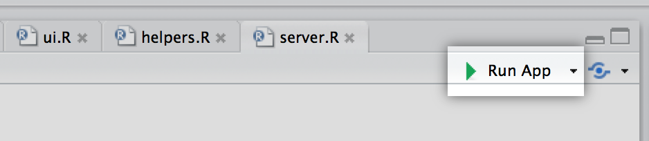
Create the ui.R and server.R files in the same directory as helpers.R, which you created at the end of the previous section. RStudio automatically detects that the files are Shiny application and adds a “Run App” button the toolbar above the editor.
Use that button to preview the application. It should pop up a window similar to the one below:
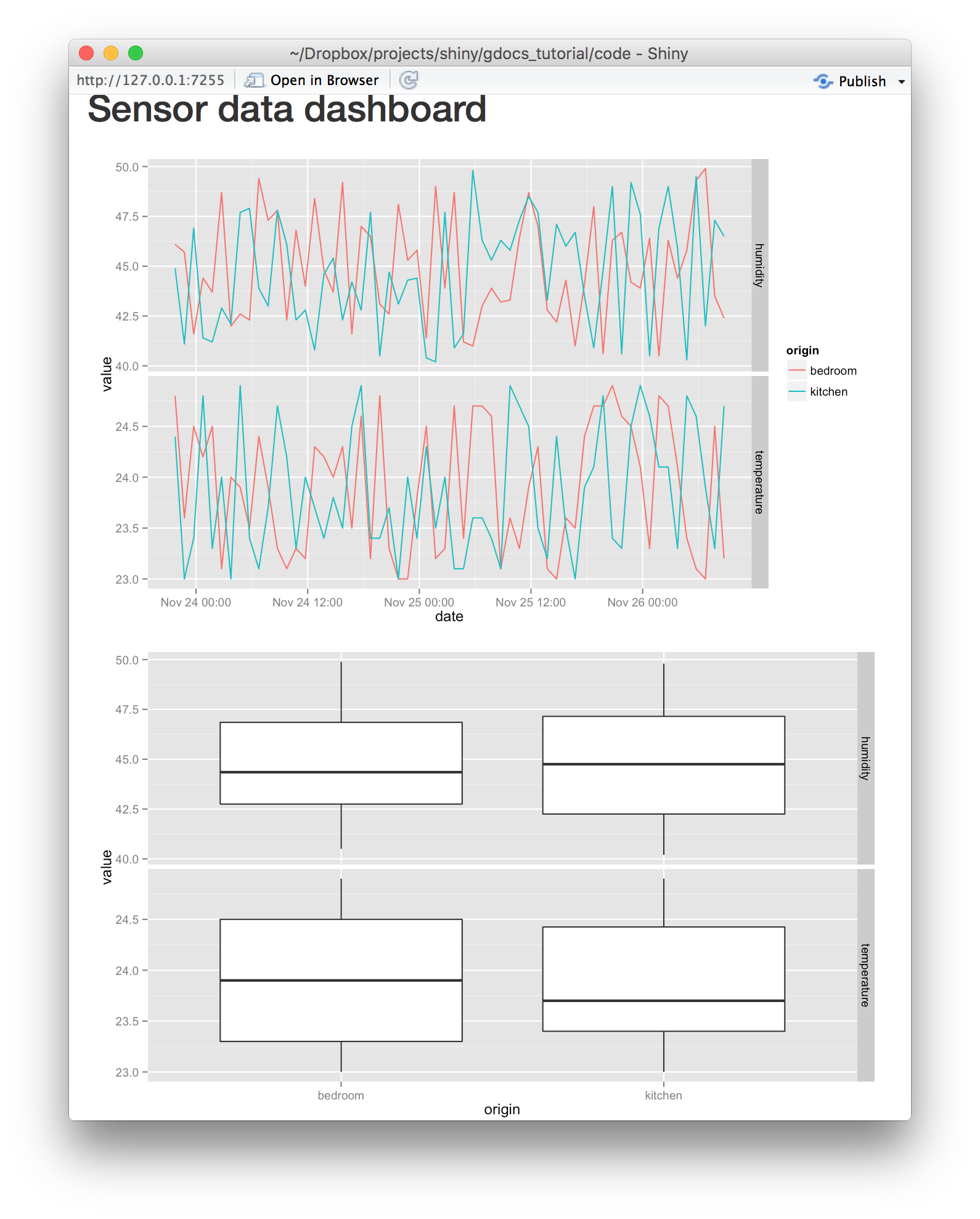
Note that none of our code detects changes on the google document; you still need to refresh the page to get the latest data.
Add a grid layout and filter by date
Let’s now add some date selection widgets that restrict the displayed date range. We’ll first extend the layout from a simple vertical stack to a fluid grid. On sufficiently wide displays, this layout shows up as a grid. On narrower displays, it reverts to a vertical stack, to avoid lateral scrolling. Grids are specified as fluidRow elements which contain column elements. Each column is assigned a width (in units of 1/12 of the screen width) and can contain another widget (an input, a plot, or another grid). The new ui.R file below now shows a layout with nested rows and columns.
Our second modification is to add input widgets. Inputs allow users to interact with the visualization by entering text, number, dates, selecting from radio boxes…You can browse the full gallery here.
We’ll use two kinds of inputs:
dateRangeInput: a drop-down calendar to chose a start and end date.numericInput: a box which accepts only numbers, and shows an up- and down-arrow to change the numbers.
We use the dateRangeInput to specify the date range of data to plot, and four numeric inputs to specify the hours and minutes of the start day, and the hours and minutes of the end day.
# ui.R

shinyUI(fluidPage(
  verticalLayout(
    titlePanel("Sensor data dashboard"),
    fluidRow(
      column(3,
             dateRangeInput("dates", "Date Range", start="2015-11-20"),
             fluidRow(
               column(4, h3("From:")),
               column(4, numericInput("min.hours", "hours:", value=0)),
               column(4, numericInput("min.minutes", "minutes:", value=0))
             ),
             fluidRow(
               column(4, h3("To:")),
               column(4, numericInput("max.hours", "hours:", value=23)),
               column(4, numericInput("max.minutes", "minutes:", value=59))
             )
      ),
      column(9, plotOutput("timeseries"))
    ),
    fluidRow(
      column(3),
      column(9, plotOutput("boxplot"))
    )
  )
))
The server-side code can access the values of the input widgets through the input argument of ShinyServers’s callback. When one of the inputs is changed on the UI, Shiny automatically re-executes any of the server’s renderPlot or reactive code blocks that access that value. The reactive blocks are useful to transform data according to input values; we will thus use one to apply the date range filter.
The reactive block in the new code example below converts our inputs to two POSIXct date objects, then uses them as lower and upper bounds to filter the data frame. We assign the reactive code block to data.filt, and modify the renderPlot calls to plot data.filt() instead of the original data. Note the syntax: data.filt() returns the value of the code block passed to reactive. As explained above, each time one of the inputs used inside the reactive block is updated, any other code block which calls data.filt() is also updated. In the example below, both renderPlot blocks are re-executed on update.
Warning: make sure to include the parenthesis each time you call data.filt()!
# server.R

source("helpers.R")

shinyServer(function(input, output) {

  # Load data when app is visited
  data <- getRaw()

  # Filter by device ID / time range when options are updated
  data.filt <- reactive({
    mindate <- as.POSIXct.Date(input$dates[1]) + (input$min.hours * 60 + input$min.minutes) * 60
    maxdate <- as.POSIXct.Date(input$dates[2]) + (input$max.hours * 60 + input$max.minutes) * 60

    subset(data, date > mindate & date < maxdate)
  })

  # Populate plots
  output$timeseries <- renderPlot({
    timeseriesPlot(data.filt())
  })

  output$boxplot <- renderPlot({
    boxPlot(data.filt())
  })

})
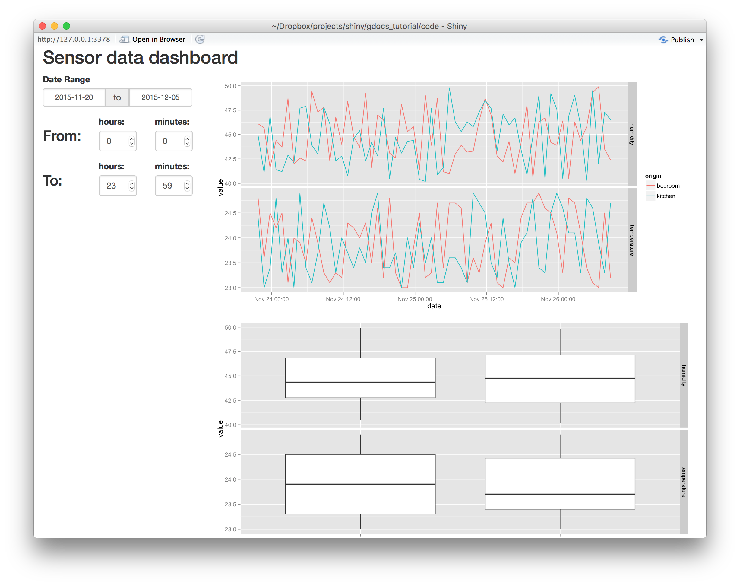
Run the application again. The new result should resemble my example below:
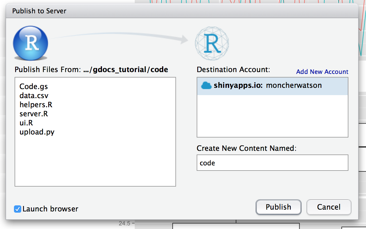
Publish to Shinyapps.io
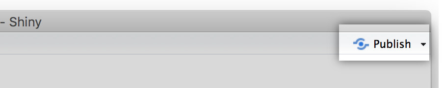
ShinyApps.io provides a hosting service for Shiny apps, and is another product by the makers of RStudio. Their developers integrated the service into RStudio: simply click “Publish” in the upper right corner of your Shiny app preview, and follow the instructions! Create a free account and upload your dashboard.
Once the app is published, you will notice a problem remains: nothing shows up on your dashboard. If you check the server logs, you’ll notice that HTTPS requests from R to Google Sheets failed. The final section of our tutorial, below, will explain how to work around that.
Using an https to http proxy
Sadly, ShinyApps (at the time of writing) doesn’t support https URLs, and thus blocks the request to Google Sheets. To work around this, we need to route the requests through an external server (a proxy) which is accessible through HTTP, can fetch the target HTTPS page, and return it back to R’s read.csv request through HTTP. Doing this goes against the security benefits of HTTPS, but since we are making a public dashboard from data publicly available on a Google Sheet, and mostly for demonstration only, I’m not concerned about it.
To save you the work, I set up a HTTPS-to-HTTP proxy server. In the server.R code, add shinyproxy.appspot.com/ before script.google.com/. In my case, the URL becomes:
# fragment of helpers.R

data <- read.csv(
  url("https://shinyproxy.appspot.com/script.google.com/macros/s/AKfycbxOw-Tl_r0jDV4wcnixdYdUjcNipSzgufiezRKr28Q5OAN50cIP/exec?sheet=Raw"),
  strip.white = TRUE
)
Re-publish your dashboard, and you are done!
More on the proxy
The HTTPS proxy is a simple piece of Go code hosted on App Engine. I put the code on github, here: https://github.com/douglas-watson/httpsproxy