Curve fitting on batches in the tidyverse: R, dplyr, and broom
Sep 9, 2018 · 8 minute read · CommentsUpdated August 2020: changed to broom’s newer nest-map-unnest pattern, from the older group_by-do pattern.
I recently needed to fit curves on several sets of similar data, measured from different sensors. I found how to achieve this with dplyr, without needing to define outside functions or use for-loops. This approach integrates perfectly with my usual dplyr and ggplot2 workflows, which means it adapts to new data or new experimental conditions with no changes. Here are the ready-made recipes for any one else who may run into a similar problem.
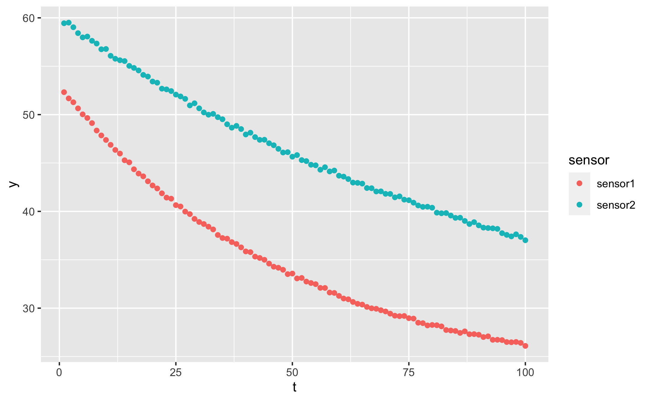
First we’ll generate some artificial data so that you can follow along at home. Here’s an exponentially decaying value measured by two sensors at different locations:
# if needed
install.packages(c("tidyverse", "broom"))

library(tidyverse)
library(broom)

t = 1:100
y1 = 22 + (53 - 22) * exp(-0.02 * t) %>% jitter(10)
y2 = 24 + (60 - 22) * exp(-0.01 * t) %>% jitter(10)


df <- tibble(t = t, y = y1, sensor = 'sensor1') %>%
  rbind(. , data.frame(t = t, y = y2, sensor = 'sensor2'))
Our data frame looks like this:
df
| t | y | sensor |
|---|---|---|
| 1 | 52.25302 | sensor1 |
| 2 | 51.71440 | sensor1 |
| 3 | 51.13971 | sensor1 |
| … | … | … |
| 98 | 38.13328 | sensor2 |
| 99 | 38.17017 | sensor2 |
| 100 | 37.72184 | sensor2 |
And our data looks like this:
qplot(t, y, data = df, colour = sensor)
I created the data in long format, as it works best with dplyr pipelines. You can read more about long format vs wide format data here.
TL;DR
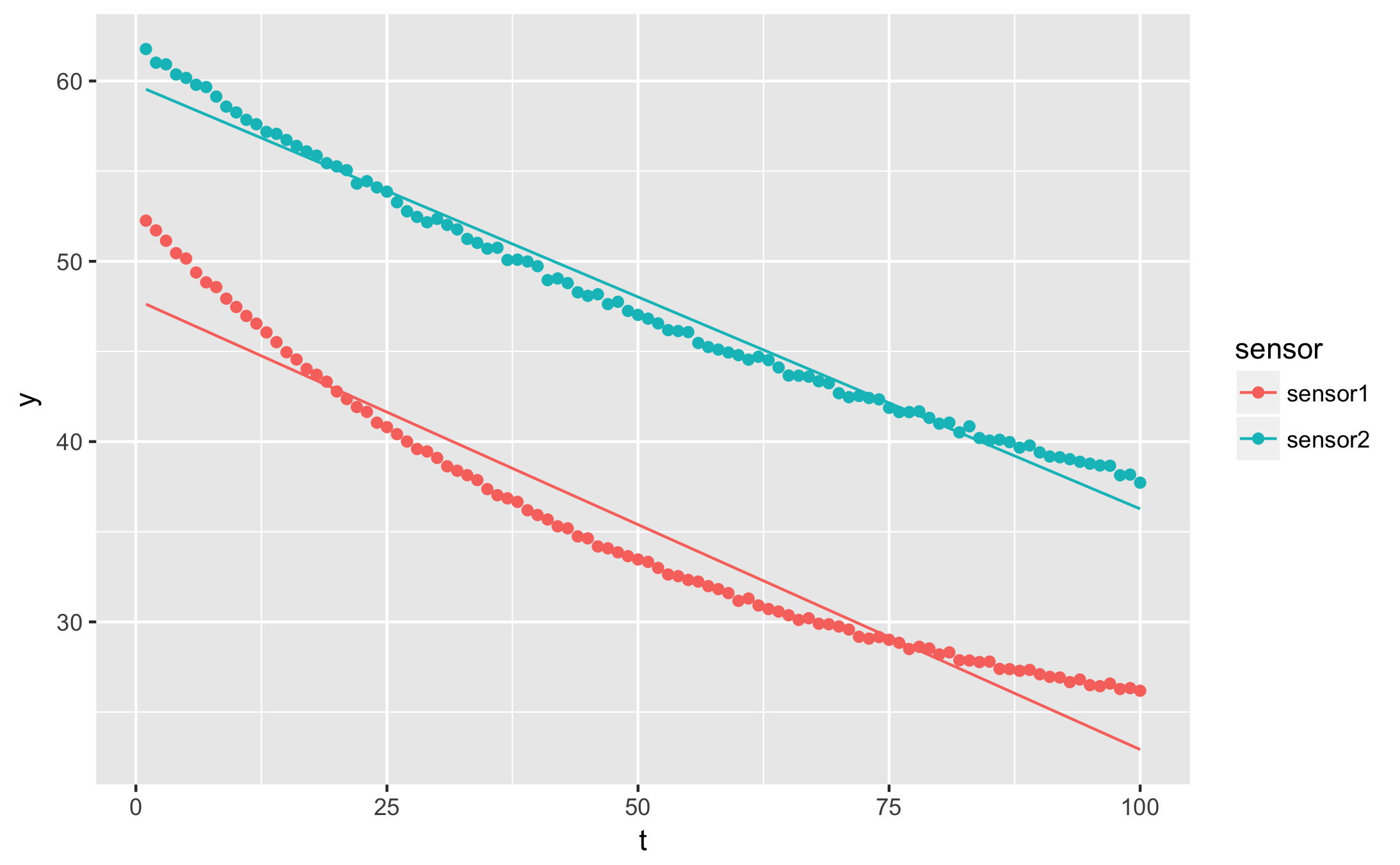
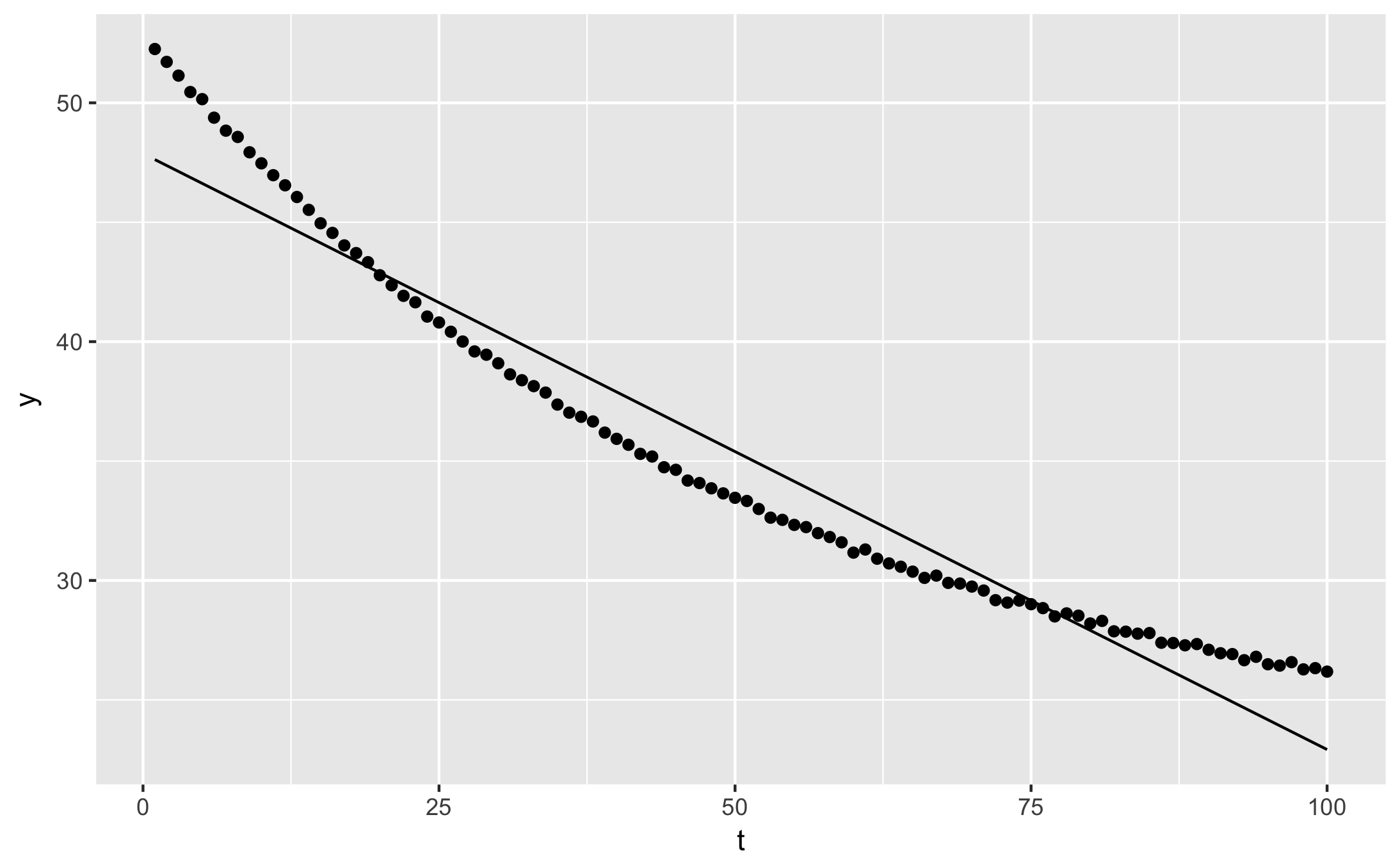
I want to plot the fitted curve over my data points
augmented <- df %>%
  nest(-sensor) %>%
  mutate(
    fit = map(data, ~ nls(y ~ a * t + b, data = .)),
    augmented = map(fit, augment),
  ) %>%
  unnest(augmented)

qplot(t, y, data = augmented, geom = 'point', colour = sensor) +
  geom_line(aes(y=.fitted))
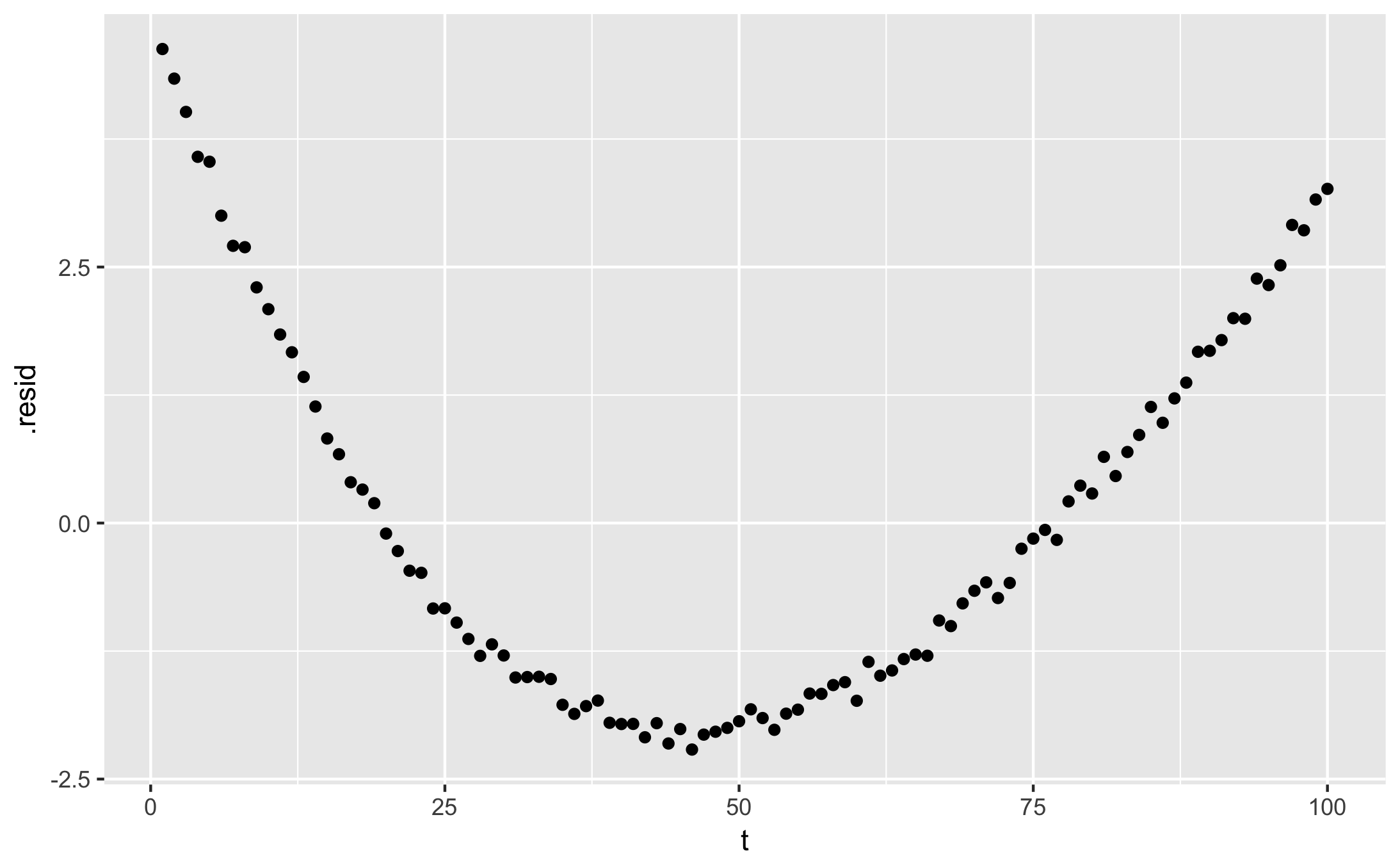
I want to plot the residuals
qplot(t, .resid, data = augmented, colour = sensor)
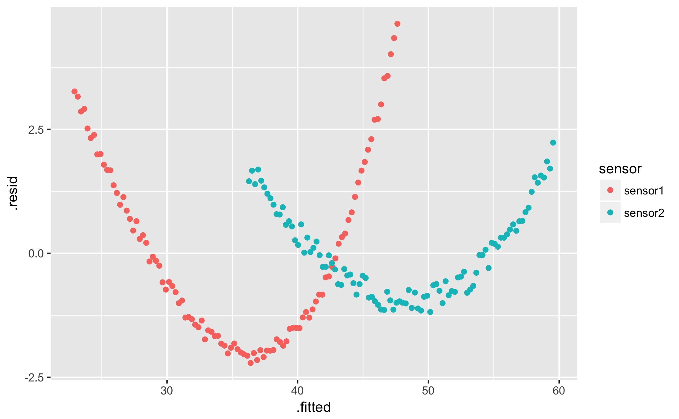
qplot(.fitted, .resid, data = augmented, colour = sensor)
I want a table of my fit parameters for each condition:
df %>%
  nest(-sensor) %>%
  mutate(
    fit = map(data, ~ nls(y ~ a * t + b, data = .)),
    tidied = map(fit, tidy),
  ) %>%
  unnest(tidied) %>%
  select(sensor, term, estimate) %>%
  spread(term, estimate)
| sensor | a | b |
|---|---|---|
| sensor1 | -0.2495347 | 47.87376 |
| sensor2 | -0.2350898 | 59.77793 |
I want a less horrendous fit. How can I do better?
Try with an actual exponential. You’ll probably want a self-starting function to avoid the “singular gradient” error — read more in my post on the subject.
Explanation: intro to curve fitting in R
The goal of our fitting example was to find an estimate $\hat{y}(t) = a t + b$ that approximates our measured data $y$. In R, we can directly write that we want to approximate $y$ as a function $a \cdot t + b$, using the very intuitive built-in formula syntax:
y ~ a * t + b
In R’s documentation, $a$ and $b$ are the coefficients, $t$ is the independent variable and $y$ is the dependent variable — $t$ can go about its day without every knowing $y$ exists, but $y$ can’t progress without knowing the latest trend in $t$.
We fit these models using various fitting functions: lm or glm for linear models or nls for non-linear least squares for example. I’m using nls here because I can specify the names of my coefficients, which I find clearer to explain:
# Select the data from our first sensor:
sensor1 <- df %>% filter(sensor == "sensor1")

# Fit our model:
fit <- nls(y ~ a * t + b, data = sensor1)

# nls works best if we specify an initial guess for the coefficients,
# the 'start' point for the optimisation:
fit <- nls(y ~ a * t + b, data = sensor1, start = list(a = 1, b = 10))
The fitting functions all return a fit object:
> summary(fit)
Formula: y ~ a * t + b

Parameters:
   Estimate Std. Error t value Pr(>|t|)
a -0.249535   0.006377  -39.13   <2e-16 ***
b 47.873759   0.370947  129.06   <2e-16 ***
---
Signif. codes:  0 '***' 0.001 '**' 0.01 '*' 0.05 '.' 0.1 ' ' 1

Residual standard error: 1.841 on 98 degrees of freedom

Number of iterations to convergence: 1
Achieved convergence tolerance: 1.571e-09
You can use one of these base R functions to extract useful data from the fit object:
coef(fit)returns the values of the coefficients $a$ and $b$.predict(fit)returns $\hat{y}(t_i)$, i.e. it applies the fitted model to each of the original data points $t_i$. It can also be applied on new values of $t$.resid(fit)returns the residuals $y_i - \hat{y}(t_i)$ at each point of the original data.
Try them out in the console:
> coef(fit)
         a          b
-0.2495347 47.8737585

> predict(fit)
[1] 47.62422 47.37469 47.12515 46.87562 46.62609 46.37655 ...

> predict(fit, newdata = data.frame(t = 101:200))
[1] 22.67076 22.42122 22.17169 21.92215 21.67262 21.42309 ...

> resid(fit)
[1] 4.628798 4.339712 4.014558 3.576258 3.528138 3.001447 ...
Now these functions all return vectors, which work best with R’s native plotting functions. To integrate with dplyr and ggplot, we’d rather have data frames or tibbles. This is where the broom package comes in.
Introducing broom
Broom is a separate R package that feeds on fit results and produces useful data frames. Install it directly within the R console if you haven’t already:
install.packages('broom')
library(broom)
It provides three useful functions, which are easier to demonstrate than to explain. All of them return data frames:
- tidy extracts the fit coefficients and related information. The term column contains the name of your coefficient, and estimate contains its fitted value:
tidy(fit)
| term | estimate | std.error | statistic | p.value |
|---|---|---|---|---|
| a | -0.2495347 | 0.006377179 | -39.12932 | 1.267667e-61 |
| b | 47.8737585 | 0.370946838 | 129.05827 | 3.123848e-111 |
- augment is equivalent to
predictandresidcombined. The returned data frame contains columnstandywith your original data, as well as.fitted, the fitted curve, and.resid, the residuals:
augment(fit)
| t | y | .fitted | .resid |
|---|---|---|---|
| 1 | 52.25302 | 47.62422 | 4.62879752 |
| 2 | 51.71440 | 47.37469 | 4.33971163 |
| 3 | 51.13971 | 47.12515 | 4.01455804 |
| 4 | 50.45188 | 46.87562 | 3.57625801 |
| … | … | … | … |
You can plot the ‘augmented’ fit with qplot:
qplot(t, y, data = augment(fit)) + geom_line(aes(y = .fitted))
qplot(t, .resid, data = augment(fit))
- glance shows fit statistics:
glance(fit)
| sigma | isConv | finTol | logLik | AIC | BIC | deviance | df.residual |
|---|---|---|---|---|---|---|---|
| 1.840841 | TRUE | 1.571375e-09 | -201.906 | 409.8119 | 417.6274 | 332.0921 | 98 |
Using broom with dplyr
Since broom’s functions return data frames, they integrate naturally with magrittr pipelines (%>%) and dplyr. Let’s illustrate by grouping the data by sensor id, then producing a fit object for each group. The nest function creates a new tibble with one line per sensor. Each line contains the name of the sensor (in the sensor column) and an embedded tibble with that sensor’s data (in the data column):
df %>%
  nest(-sensor)
| sensor | data |
|---|---|
| sensor1 | <tibble> |
| sensor2 | <tibble> |
Each <tibble> here contains the $t$ and $y$ columns, with rows from one sensor.
We can then map the fitting function onto each sensor’s tibble to create a new column with fit results:
fitted <- df %>%
  nest(-sensor) %>%
  mutate(
    fit = map(data, ~ nls(y ~ a * t + b, data = .)),
  )
fitted
| sensor | data | fit |
|---|---|---|
| sensor1 | <tibble> |
<S3: nls> |
| sensor2 | <tibble> |
<S3: nls> |
We now have one nls object per group, which can be fed into either tidy or augment. Again, we use map to apply these functions to each separate nls object:
fitted %>%
  mutate(tidied = map(fit, tidy))
| sensor | data | fit | tidied |
|---|---|---|---|
| sensor1 | <tibble> |
<S3: nls> |
<tibble> |
| sensor2 | <tibble> |
<S3: nls> |
<tibble> |
To actually use the result we unnest it into a regular tibble. Unnest inflates each sensor’s tibble and concatenates them (rbinds them, similarly to how we created df in the first place):
fitted %>%
  mutate(tidied = map(fit, tidy)) %>%
  unnest(tidied)
| sensor | data | fit | term | estimate | std.error | statistic | p.value |
|---|---|---|---|---|---|---|---|
| sensor1 | <tibble> |
<S3: nls> |
a | -0.2492956 | 0.006427426 | -38.78622 | 2.853154e-61 |
| sensor1 | <tibble> |
<S3: nls> |
b | 47.8620767 | 0.373869603 | 128.01810 | 6.872225e-111 |
| sensor2 | <tibble> |
<S3: nls> |
a | -0.2357433 | 0.003189115 | -73.92124 | 9.150052e-88 |
| sensor2 | <tibble> |
<S3: nls> |
b | 59.8061527 | 0.185503969 | 322.39824 | 4.294989e-150 |
From here, we can use select and spread to generate a more succinct table, as in the TL;DR example, or keep the table as-is to inspect the quality of the fit.
The result of augment is a long data frame that can be used immediately with qplot, also shown in the TL;DR section above:
fitted %>%
  mutate(augmented = map(fit, augment)) %>%
  unnest(augmented)
| sensor | data | fit | t | y | .fitted | .resid |
|---|---|---|---|---|---|---|
| sensor1 | <tibble> |
<S3: nls> |
1 | 52.41684 | 47.58220 | 4.834645067 |
| sensor1 | <tibble> |
<S3: nls> |
2 | 51.64323 | 47.33347 | 4.309757950 |
| sensor1 | <tibble> |
<S3: nls> |
3 | 51.09595 | 47.08475 | 4.011196179 |
| … | … | … | … | … | … | … |
| sensor2 | <tibble> |
<S3: nls> |
98 | 38.06029 | 36.72428 | 1.336007642 |
| sensor2 | <tibble> |
<S3: nls> |
99 | 37.86891 | 36.48926 | 1.379642201 |
| sensor2 | <tibble> |
<S3: nls> |
100 | 37.89936 | 36.25425 | 1.645117019 |
That’s it for broom and dplyr. The magic of this approach is that you can add a sensor to your input data then re-run all your code; your new curves will just appear on the plots. Similarly, you can change the formula of your fit, and your new coefficients will appear as a new column in the coefficients table. No need to rewrite all your code.
References
- R documentation: https://stat.ethz.ch/R-manual/R-devel/library/stats/html/nls.html
- Data transformation cheat sheet: https://github.com/rstudio/cheatsheets/raw/master/data-transformation.pdf
- Stack overflow: https://stackoverflow.com/questions/24356683/apply-grouped-model-back-onto-data
- Stack overflow: https://stackoverflow.com/questions/22713325/fitting-several-regression-models-with-dplyr