Fitting exponential decays in R, the easy way
Sep 9, 2018 · 4 minute read · CommentsUpdated in May 2020 to show a full example with qplot.
Updated in August 2020 to show broom’s newer nest-map-unnest pattern and use tibbles instead of data frames. The original code no longer worked with broom versions newer than 0.5.0.
Exponential decays can describe many physical phenomena: capacitor discharge, temperature of a billet during cooling, kinetics of first order chemical reactions, radioactive decay, and so on. They are useful functions, but can be tricky to fit in R: you’ll quickly run into a “singular gradient” error. Thankfully, self-starting functions provide an easy and automatic fix. Read on to learn how to use them.
The formula I’ll use in the following examples is: $$ y(t) \sim y_f + (y_0 - y_f) e^{-\alpha t} $$
The measured value $y$ starts at $y_0$ and decays towards $y_f$ at a rate $\alpha$. Let’s generate some artificial data so you can replicate the examples:
library(tidyverse)
library(broom)

t = 1:100
y1 = 22 + (53 - 22) * exp(-0.02 * t) %>% jitter(10)
y2 = 24 + (60 - 24) * exp(-0.01 * t) %>% jitter(10)


df <- tibble(t = t, y = y1, sensor = 'sensor1') %>%
  rbind(. , data.frame(t = t, y = y2, sensor = 'sensor2'))
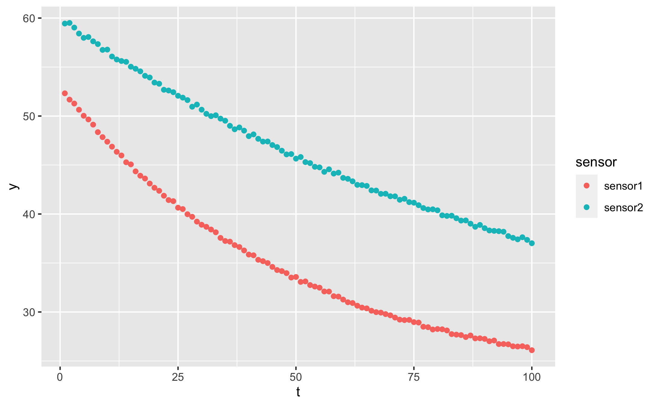
Our data looks like this:
qplot(t, y, data = df, colour = sensor)
Fitting with NLS
nls is the standard R base function to fit non-linear equations. Trying to fit the exponential decay with nls however leads to sadness and disappointment if you pick a bad initial guess for the rate constant ($\alpha$). This code:
sensor1 <- df %>% filter(sensor == 'sensor1')
nls(y ~ yf + (y0 - yf) * exp(-alpha * t),
    data = sensor1,
    start = list(y0 = 54, yf = 25, alpha = 1))
fails with:
Error in nls(y ~ yf + (y0 - yf) * exp(-alpha * t), data = sensor1, start = list(y0 = 54,  :
  singular gradient
Using SSasymp
The solution is to use a self-starting function, a special function for curve fitting that guesses its own start parameters. The asymptotic regression function, SSasymp is equivalent to our exponential decay:
> fit <- nls(y ~ SSasymp(t, yf, y0, log_alpha), data = sensor1)
> fit
Nonlinear regression model
  model: y ~ SSasymp(t, yf, y0, log_alpha)
   data: sensor1
       yf        y0 log_alpha
   21.884    52.976    -3.921
 residual sum-of-squares: 0.9205

Number of iterations to convergence: 0
Achieved convergence tolerance: 8.788e-07
Its formula is a little different from ours, instead of fitting the rate constant $\alpha$ directly: $$ y(t) \sim y_f + (y_0 - y_f) e^{-\alpha t} $$
it searches for the logarithm of $\alpha$:
$$ y(t) \sim y_f + (y_0 - y_f) e^{-\exp(\log\alpha) t} $$
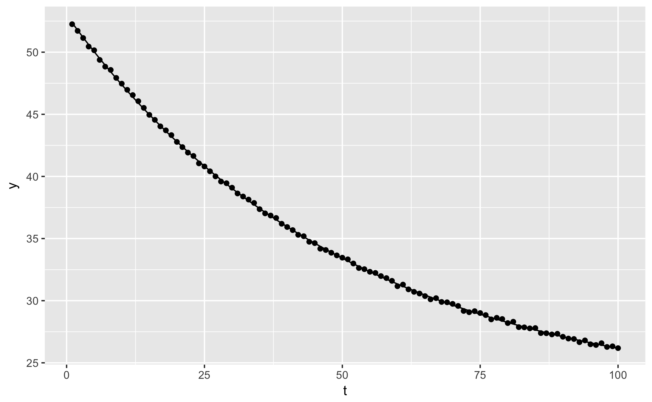
From the fit result, you can plot the fitted curve, or extract whichever information you need:
qplot(t, y, data = augment(fit)) + geom_line(aes(y = .fitted))
For a single curve, it’s easy to guess the approximate fit parameters by looking at the plot, or just by trying several values. When fitting many curves however, it is more convenient to automate the process. Self-starting functions are especially useful combined with dplyr, to fit several experimental conditions in one step.
Here is how we can read out the fit parameters for each sensor in our example data:
# Fit the data
fitted <- df %>%
  nest(-sensor) %>%
  mutate(
    fit = map(data, ~nls(y ~ SSasymp(t, yf, y0, log_alpha), data = .)),
    tidied = map(fit, tidy),
    augmented = map(fit, augment),
  )

# Produce a table of fit parameters: y0, yf, alpha
fitted %>%
  unnest(tidied) %>%
  select(sensor, term, estimate) %>%
  spread(term, estimate) %>%
  mutate(alpha = exp(log_alpha))
| sensor | log_alpha | y0 | yf | alpha |
|---|---|---|---|---|
| sensor1 | -3.908686 | 52.99619 | 22.04402 | 0.020066853 |
| sensor2 | -4.627930 | 59.99358 | 23.42025 | 0.009774973 |
Now we know at one glance the rate constant for each sensor location, or the $y$ value that each position will stabilise at.
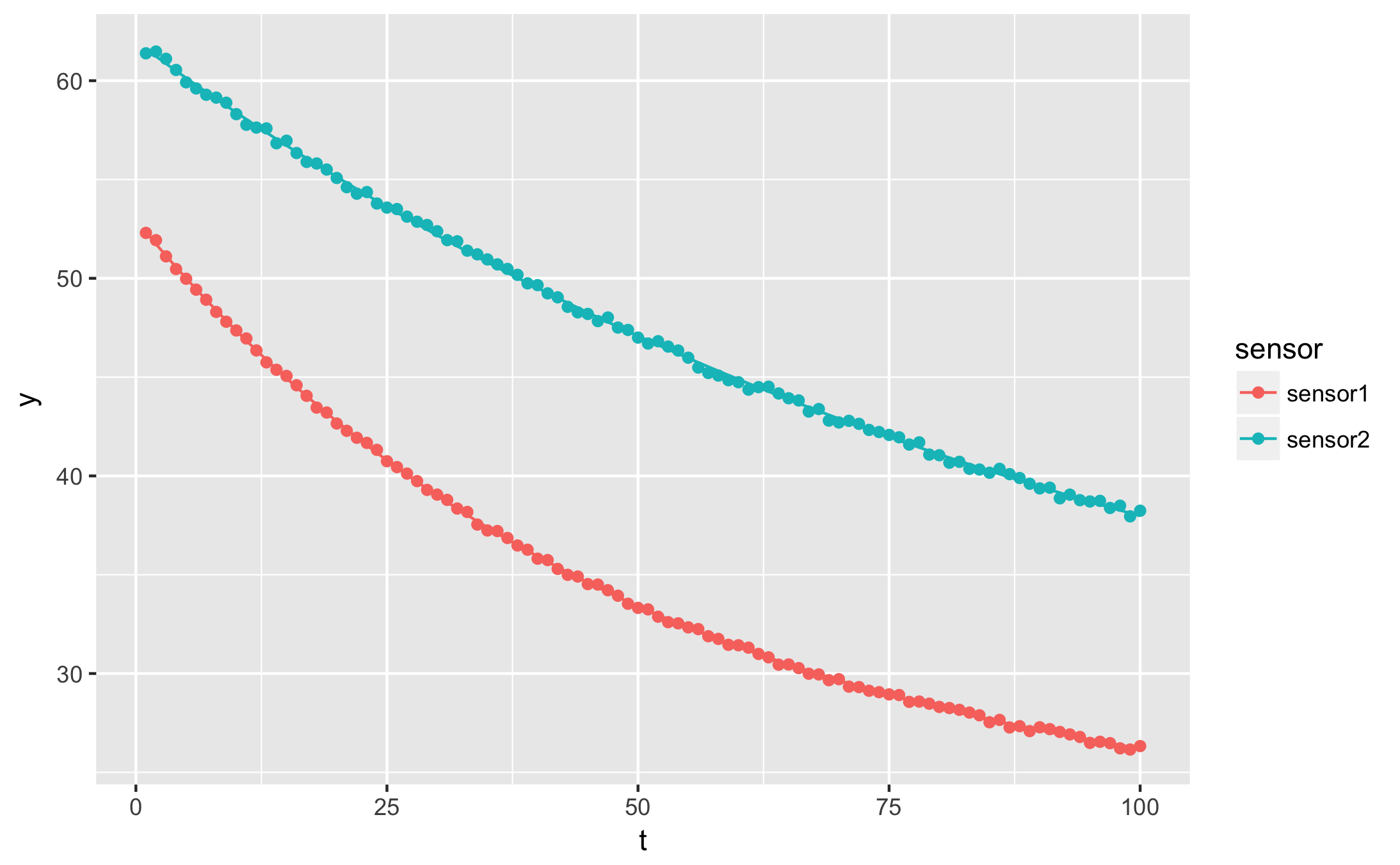
Plotting with gglot2
To show both fitted curves on the original data, use broom’s augment function:
augmented <- fitted %>%
  unnest(augmented)
qplot(t, y, data = augmented, geom = 'point', colour = sensor) +
  geom_line(aes(y=.fitted))

ggsave("ggplot_exponential_fit.png")
augment also yields the residuals. For more ideas on how to apply curve fitting with dplyr, check out my previous article on dplyr. Refer to the updated official vignette on broom with dplyr for explanations on the newer nest-map-unnest pattern.